HTML・CSSで刀で斬るようなアニメーション
最近LIGのブログを見る機会が多くなった。LIGは面白法人カヤックやバーグハンバーグバーグの流れを汲んだキワモノ系の制作会社で、そのLIGのブログが技術系の記事が増えてきたので毎日読んでる。昨日も刀でズバッと斬るようなアニメーションをHTML・CSS・JS(jQuery)で実装する方法 | 株式会社LIGを読んで「さすがLIG、このタイミングで首をはねるアニメーションを作るとは・・・」とも思ったが俺も作ってみた。
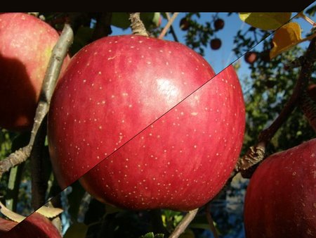
まずLIG版はPhotoShopで加工して3枚の画像を作ってたが、こっちはclip-path(CSS)を使って切り抜くことにした(clip-pathはIEが未対応なので実務的には使う機会が少ない)、clip-pathを使ってブラウザ上で切り抜いてるのでどっからでも引っ張ってこれる。画像は倫理的な問題からamazonのリンゴ画像にした。
ちなみにLIG版はアニメーション終わりのイベント取得にwebkitAnimationEndしか使って無いためwebkit系でしか動かないけど「animationend webkitAnimationEnd oAnimationEnd」な感じで入れたらFirefoxや旧operaでも動くようになる。
clip-pathは先月の工夫のあるUIがいい!CSSで円・楕円・多角形などのクリップパスが簡単に作成できるオンラインサービス -Clippy | コリスで知ってから気にはなっていたが、firefoxが動かなかったので、まだまだ未来の技術だと思ってスルーしていたが、今回改めて調べるとclip-pathで指定するクリップパスはwebkit用の「CSSの直書き」とfirefox用の「SVG内部参照」「SVG外部参照」の3パターンの設定方法があるが、Clippyがwebkitにしか対応していないだけで、自前でSVGを用意してやると切り抜ける事が分った。(それでもIEは未対応だが)
LIGの人も書いてるが斜めに切り取った画像を並べると微妙に隙間が空く。そこで、あえて隙間を空けて斬る前のシーンの為に後ろに切り取ってない画像を用意した。その画像をずらして斬った風な感じを出してる。
LIG版は上下が切り離されてる感じになってたが、板を切った様に上部が崩れ落ちる風のアニメーションにした。
あと、LIG版はjQueryでアニメーションの開始終了を制御してるが、ごてごてするのでanimationのディレイで誤魔化した。
CSS
@keyframes slashSord {
  0%   {transform: translate3d(0,0,0);}
  100% {transform: translate3d(-640px,0,0);}
}

@keyframes slashUp{
  0%   {transform: translate3d(0,0,0) rotate(0deg);}
  70%  {transform: translate3d(-32px,24px,0) rotate(0deg);}
  75%  {transform: translate3d(-32px,24px,0) rotate(0deg);}
  100% {transform: translate3d(64px,540px,0) rotate(-80deg);}
}
@-webkit-keyframes slashSord {
  0%   {-webkit-transform: translate3d(0,0,0);}
  100% {-webkit-transform: translate3d(-640px,0,0);}
}

@-webkit-keyframes slashUp{
  0%   {-webkit-transform: translate3d(0,0,0) rotate(0deg);}
  70%  {-webkit-transform: translate3d(-32px,24px,0) rotate(0deg);}
  75%  {-webkit-transform: translate3d(-32px,24px,0) rotate(0deg);}
  100% {-webkit-transform: translate3d(64px,540px,0) rotate(-80deg);}
}

.zan img {
  position:absolute;
  top:0;
  left:0;
}
.zan img.ue {
  -webkit-clip-path: polygon(0 479px,639px 0,0 0);
  clip-path: url("#clipPolygon7");
  -webkit-animation: slashUp 3.5s ease 2s both;
  animation: slashUp 3.5s ease 2s both;
}
.zan img.all {
  -webkit-animation: slashSord 0.25s ease 1.5s both;
  animation: slashSord 0.25s ease 1.5s both;
}
.zan img.shita {
  -webkit-clip-path: polygon(0 480px,640px 0,640px 480px);
  clip-path: url("#clipPolygon3");
}

.zan {
  position:relative;
  margin:90px auto;
  width:640px;
  height:480px;
  overflow:hidden;
}
HTML
<div class="zan"><a href="http://www.amazon.co.jp/exec/obidos/ASIN/B00SWFGK1I/ref=nosim" target="_blank">
<img src="http://ecx.images-amazon.com/images/I/81kVL7QeoxL._SL1500_SR640,480_.jpg" alt="" class="all" />
<img src="http://ecx.images-amazon.com/images/I/81kVL7QeoxL._SL1500_SR640,480_.jpg" alt="" class="ue" />
<img src="http://ecx.images-amazon.com/images/I/81kVL7QeoxL._SL1500_SR640,480_.jpg" alt="リンゴ" class="shita" />
</a></div>
<svg width="0" height="0">
<clipPath id="clipPolygon7">
<polygon points="0 479,639 0,0 0"></polygon>
</clipPath>
<clipPath id="clipPolygon3">
<polygon points="0 480,640 0,640 480"></polygon>
</clipPath>
</svg>できたアニメーションが「リンゴを斬る!」